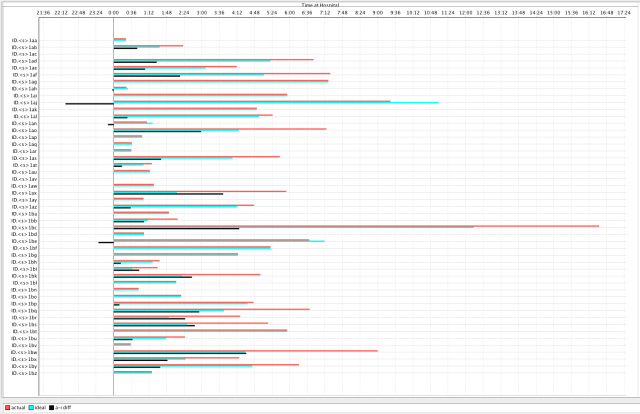
Beside each surgeon’s name is a red bar and a green bar. These bars represent the total time the surgeon had to be in the OR to finish his cases. The red bar is from ‘actual’ time recorded on the anesthesia records. The green ‘ideal’ bar is from a simulation using the actual durations, but scheduled differently. The black bar measures ‘actual’ – ‘real’.
You’ll notice that for two cases the green bars are longer than the red bars, but for all the rest the red bars are as long or longer than the green. In some cases they are over twice as long. This means most surgeons spent much longer than they needed to finish their case schedules. In fact, the total number of surgeons’ wasted hours is about 55.
In this case the OR was very busy, with most rooms being used. In the ‘ideal’ simulation, the OR did not use any extra rooms and did not stay open as long. I like analogies, and this scenario reminds me of packing a suitcase or the trunk of a car. The amount of space doesn’t change, but given the know how (and the right tools for scheduling) you can make a big difference.
The significance? If you were a surgeon, would you move your patients to a hospital where you could finish your cases in half the time? Would you do more surgery?
Below is the same chart but with only the ‘actual – ideal’ times showing. The black bars to the right of 0.00 indicated potential saved time. Those to the left of 0.00 indicate the surgeons’ whose time actually increased with the new schedule. Ways to avoid that can be discussed at another time.
update: Graphs of actual and optimized surgical schedule are on blog post dated January 20, 2010.


