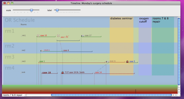
For all those OR schedulers out there, here’s a new approach. I left most of the data off on purpose to emphasize the information that the graphics—lines, blocks, fonts, colors, sizes, and proximity— can show. When in the program, pages of information along with unlimited fields about each case can be seen and inputted by clicking on the case name. The lines can be labeled with any information. Dragging and adjusting each case time automatically updates the data fields for those attributes and can be exported to any database or spreadsheet. Data collection, and changes in data collection are easy to do.
Every attribute can be altered to represent different data. In this graph, Dr. Smith’s icon is a ladybug since her online name is …’ladybug’. Dr. Jones is a sailor and chose a life preserver as his icon. The camera icon belongs to Dr. White; he likes photography. If desired, you could have a picture of your black labrador as your icon.
Each font represents a distinct OR room setup. The color of the horizontal line for each case represents a category of procedure, the vertical line represents the ASA of the patient and the potential difficulty and slowness of anesthesia in starting the case. However, the representation of every attribute can be changed. Make the bottom colors maroon and gold if those were your school colors, or make them represent who was in charge of the OR that day. The vertical lines also give you a good idea of ‘crunch time’ –lots of cases starting at once– and the difficulty in starting them (the color of line).


