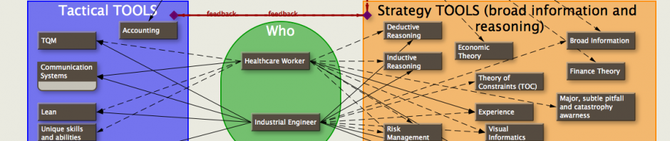
I found some graphs that I put together a couple of years ago. The results are born out empirically (at least by my experience in the OR). Lots of information about who to hire, who to fire, who to use under which circumstance, how to flip rooms, and more.
This is the type of graph that needs to be explained in an hour-long seminar. Personally, I think it’s a work of art, but then most parents think their children are cute. The graph is best looked at while drinking a cup of coffee and taking the time to see relationships.


I’ve posted a second copy of the graph that might be easier to understand.
I could write for hours about the graph. Depending on the background of my ‘audience’, it can take 15 minutes or ‘forever’ to explain the graph symbols. I’ve spent hours discussing the ramifications with a friend who is in the business of hiring anesthesiologists and CRNAs, and the conversation never really ends. Along with this graph are some other graphs that explore tangents explaining potential scheduling options with consequential revenue/cost effects, but they’re pretty dull. I posted this graph because it gets the idea across that individual people (just like on a sports team) can be dramatically different in their skill levels with resulting significant effects on outcome (revenue). For some reason, healthcare workers are often considered all the same when hiring or doing simulations—nothing could be further from the truth.